Most breathing apps bury guided exercises behind meditation subscriptions or throw too many options at the user.
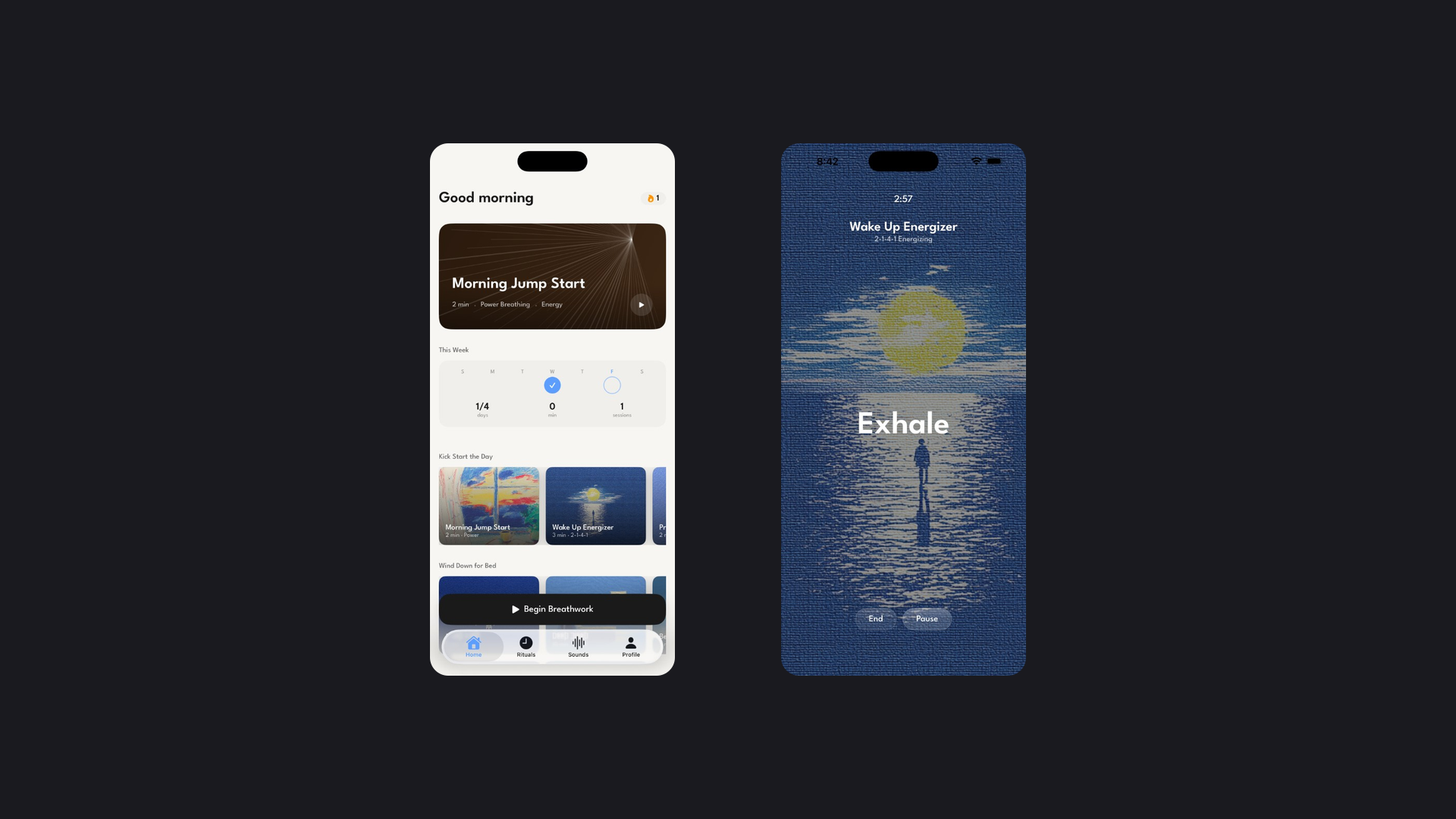
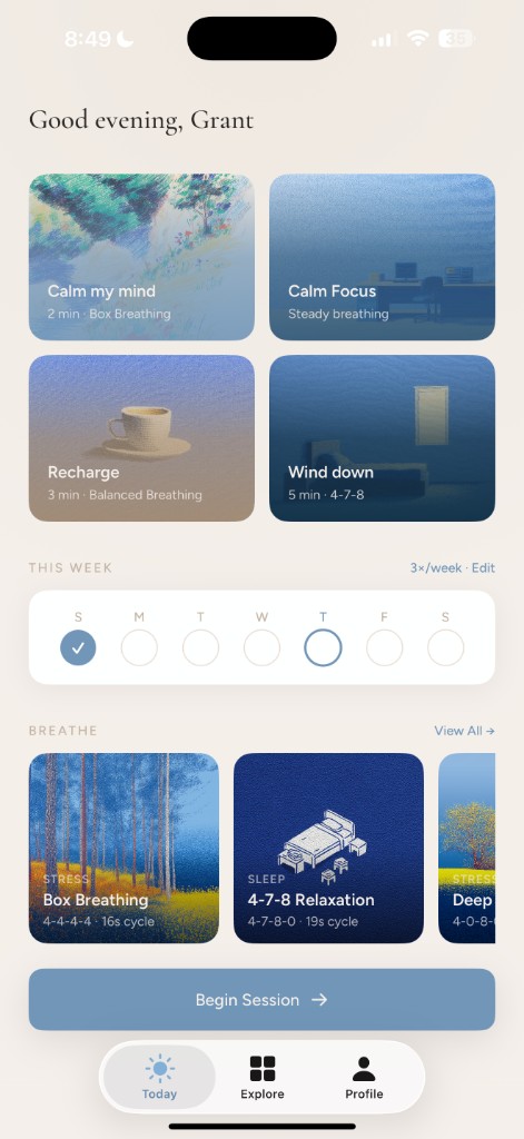
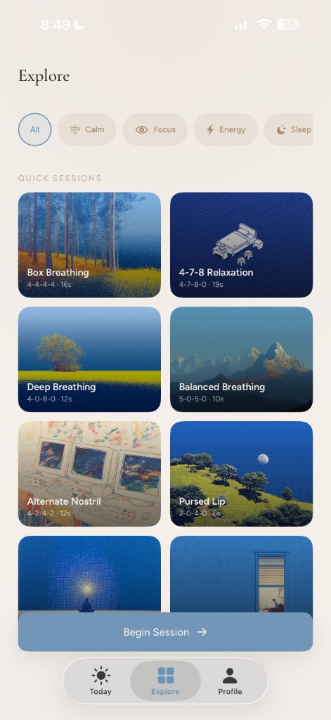
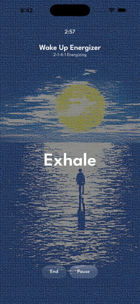
Refresh keeps it simple: a small set of curated techniques with clean visuals and haptic pacing that let you start a session in under five seconds.
I built it end-to-end to see how far one person could take a real product by being intentional about where AI helps and where it doesn't.
I ran competitive analysis across a dozen breathing and meditation apps, then used Claude to distill research on breathing techniques and the neuroscience behind them into product decisions.
The full branding guidelines document was generated as a Claude artifact and became the source of truth for every decision after — warm linens and muted blues (not the clinical whites and neon greens that dominate wellness apps), Cormorant Garamond for display, Figtree for UI.
The key insight was moving from feature-organized tabs to intent-organized navigation. The app answers "how do I feel right now" instead of "which feature do I want to use."
I drafted the full user flow as a Claude artifact before writing any code, mapping every path from opening the app to completing a session.
Native SwiftUI, built in Cursor with Claude as the coding agent. Phased: design system foundation, screen-by-screen build, feature architecture, then onboarding.
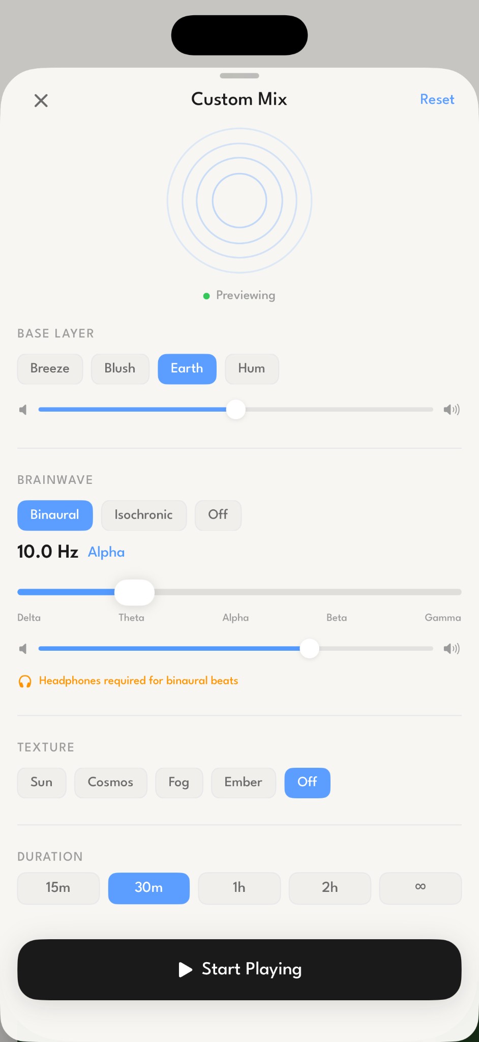
The most ambitious bet was a real-time audio engine — binaural beats, drone layers, and filtered noise textures using AVAudioEngine. Early versions produced TV static instead of ocean waves.
I shelved the engine rather than ship something half-baked.
What I learned: AI compresses the timeline between having an opinion and executing on it — but it doesn't replace taste. Every output still needed curation and a clear point of view about what good looked like.
And knowing when to ship without a feature, and being honest that it didn't meet the bar, is its own skill.